Sports fans tend to live for nostalgia. Bringing up the past and telling stories of their favorite players and teams. Regarding uniforms and jerseys, the conversation can go on for days. So, here's a conversation starter. Looking at some of the best uniforms/jerseys from defuncted sports teams. We're not including the old-school Astros, Padres, or Pirates uniforms that those teams, and others, still occasionally wear.
Steve Babineau/NHLI via Getty Images
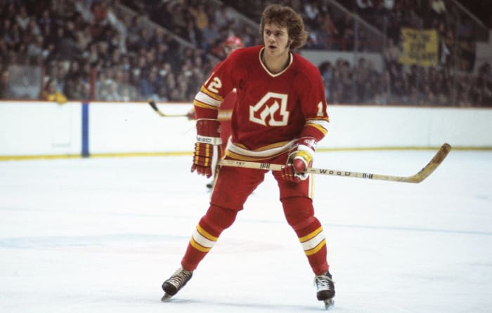
Atlanta has seen two NHL teams fail to stay in town. Between those two, the Flames had the better uniforms. The "A" with the flame in the middle was a solid look, while the red and yellow fit in with the Atlanta Hawks basketball franchise. When the franchise moved to Calgary, the flaming "C" was incorporated, but the old-school look from Atlanta is still worth celebrating.
Sports Studio Photos/Getty Images
The Dodgers wear essentially the same uniforms that they donned right before moving to Los Angeles from Brooklyn in the late 1950s. However, during the 1920s, the team sported an old-timey "B" on its jersey top to go along with the famed "B" ballcap. It's a classic uniform from a classic team that is still beloved, not just in Brooklyn, but throughout the world.
3 of 20
California Golden Seals
Denis Brodeur/NHLI via Getty Image
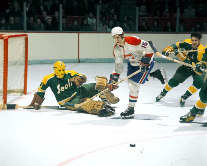
Before there were the San Jose Sharks, the Bay Area rooted for the Golden Seals. In their green and gold sweaters, the Seals, based in Oakland, were members of the NHL from 1967-'76. Obviously, it was not a long run and the club made just two playoff appearances in nine seasons. However, when talking vintage NHL jerseys, the Golden Seals tend to be one of the favorites for collectors and fans alike.
4 of 20
Caribous of Colorado
Courtesy of Caribous of Colorado/MLS
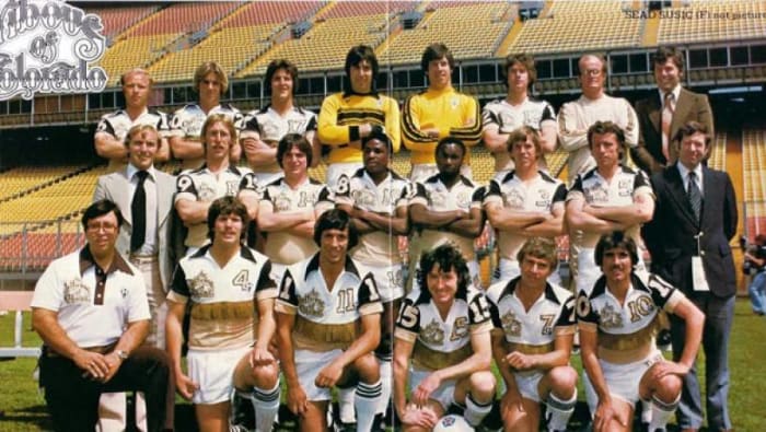
Unless there are some die-hard North American Soccer League fans still holding a torch for the famed outdoor league, not many sports folks remember the Caribous of Colorado. The club lasted one season in 1978, going 8-22. Yet, the team's kit should not be forgotten. It featured a brown, tan, and white motif, with some unforgettable leather fringe running across the chest of the uniform top. Now, that's special.
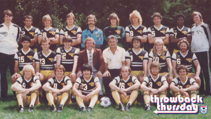
NASL
The Sting were one of the most popular members of the NASL and the Major Indoor Soccer League during the 1970s and '80s. The club, which won a championship in 1981, also donned some of the finest soccer kits in the history of both leagues. The black and yellow look, with the angry bumblebee logo on the right front, made total sense and remains one of the most recognizable in professional soccer.
Warren Wimmer/Icon Sportswire/Corbis/Icon Sportswire via Getty Images
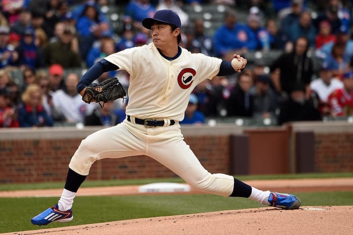
One of the great uniform tops in pro baseball history was that of the short-lived Chicago Whales. The club, with a whale inside the letter "C" logo, lasted just one season as part of the Federal League. However, the Whales were the original occupant of Wrigley Field. For that, the current day Chicago Cubs have honored the Whales by wearing their uniforms as a throwback homage in recent years.
7 of 20
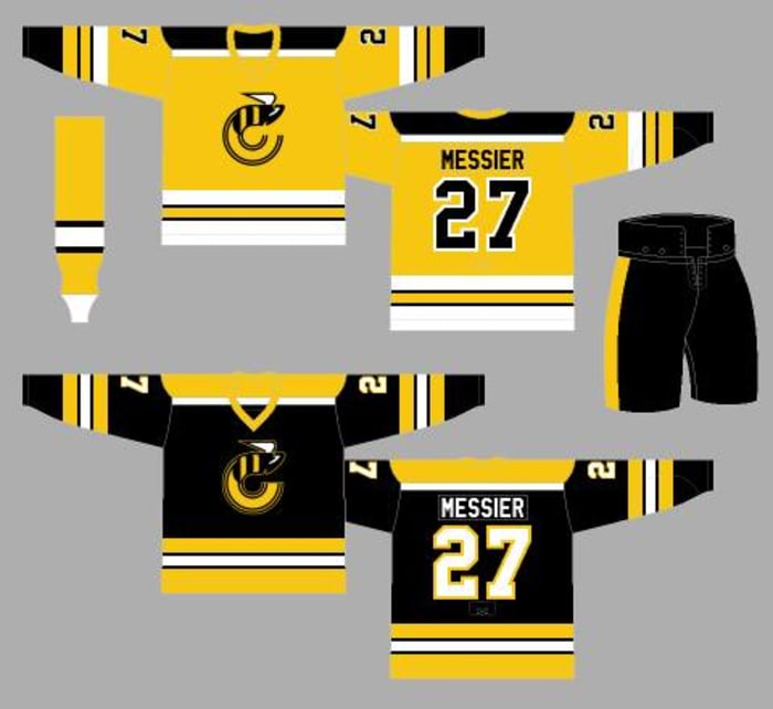
Cincinnati Stingers
whauniforms.com
The Stingers spent four seasons (1975-'79) in the old World Hockey Association. Like the Chicago Sting, went with the black-and-gold bumblebee look. While the league did not have much longevity, the Stingers' jersey remains quite popular for fans of hockey nostalgists, memorabilia collectors, and fans of Cincinnati hockey who wish there was an elite-level pro team still in town.
Cyrus McCrimmon/The Denver Post via Getty Images
Before the Colorado Rockies were a baseball team, a group of the same name played in the NHL from 1976-'82. The franchise, which came from Kansas City and eventually left for New Jersey, won just 113 games and made one playoff appearance in those six seasons in Denver. As far as the sweater, the team's logo crest and arm patches were taken from the Colorado state flag with the outline of a mountain. Subtle, but solid.
Maddie Meyer/Getty Images
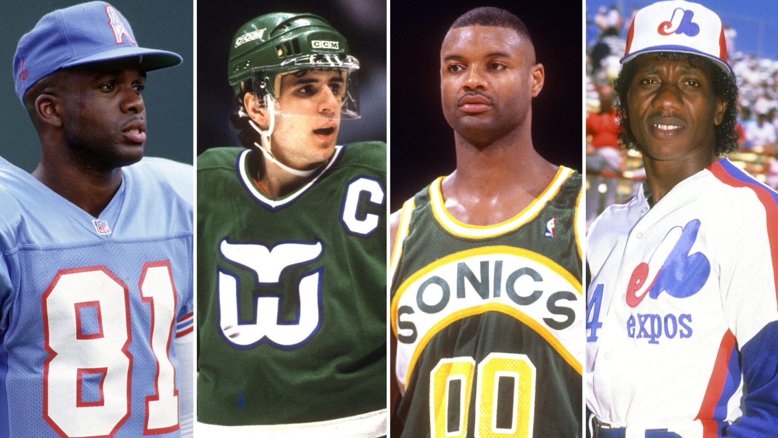
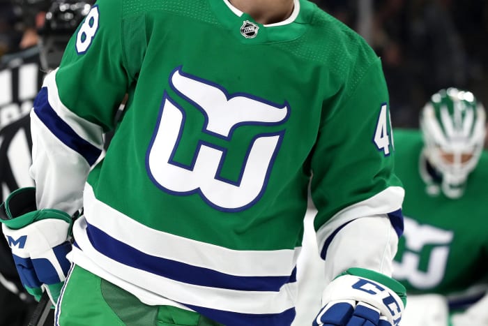
Hartford, the "Whale," did not just boast one of the most iconic logos in NHL history, but all-time in the sports world. The "W" with the whale fin logo, especially when white on the green backdrop, is perfect and classy. Yes, since the franchise relocated to North Carolina and the Hurricanes sport those classic jerseys from time to time, but we really wish the Whale was still playing in Hartford.
10 of 20
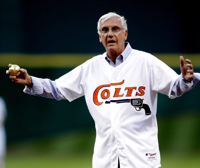
Houston Colt .45s
Bob Levey/Getty Images
Before Houston's Major League Baseball franchise became the Astros and called the Astrodome home, it was known as the Colt .45s for three seasons (1962-'64). And, they had a cool uniform with one of the best logos in MLB history. The famed gun under the word "Colts" graced the front of the jersey top. The Astros continue to celebrate the look and the early days of the franchise.
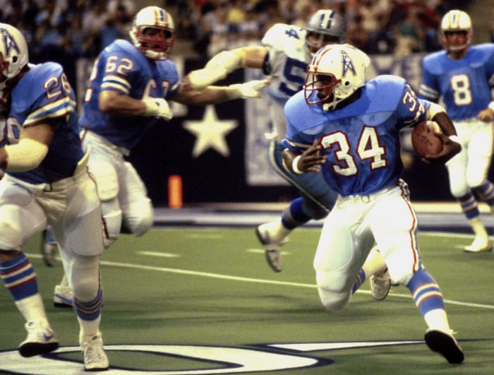
A. Kaye/Getty Images
The current Titans' NFL franchise has enjoyed plenty of success in Tennessee, but the memories of Earl Campbell running wild in the Astrodome with that powder-blue jersey and the while helmet with the oil derrick is simply classic. The Oilers helmet and the unique powder blue, red and white color scheme stood out among those "regular" looks during the NFL of the 1970s and into the '80s.
12 of 20
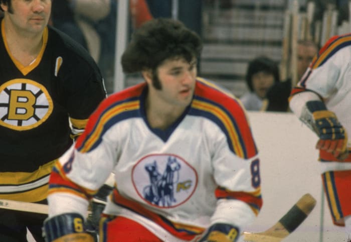
Kansas City Monarchs
Bettmann/Contributor/Getty Images
When you're the longest-running franchise in the history of the Negro Leagues, and one of the winningest all-time in pro baseball, it only makes sense to have one of the great uniforms to go with it all. The gray jersey top with "MONARCHS" etched across, the blue sleeves with red piping and the heart with KC in the middle on the sleeve is just outstanding. The hat with the line between the K and C is still one of the most popular throwback lids in all of sports.
13 of 20
Kansas City Scouts
Bruce Bennett Studios via Getty Images Studios/Getty Images
Some NHL fans might not know that the current New Jersey Devils' franchise actually started in Kansas City (before then moving to Colorado) as the Scouts. And, the Scouts had some pretty cool sweaters. While the blue, red, and yellow color scheme was somewhat questionable, the logo (reportedly inspired by "The Scout" statue overlooking downtown Kansas City) of the Indian scout on a horse remains popular among vintage uniform collectors.
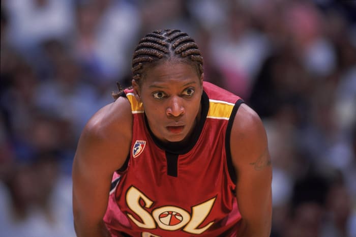
Jeff Gross/Allsport/Getty Images
The Sol lasted just three seasons (2000-'02) in the WNBA. As the sister team to the Miami Heat, the Sol sported similar uniform colors to the NBA franchise and their logo featured the WNBA basketball inside the "O" of the nickname on the front of the jersey. The Sol never won a league title, but among those defunct WNBA teams, we think their uniforms reign high.
15 of 20
Minnesota North Stars
B Bennett/Getty Images
While this particular franchise has long been in Dallas and Minnesota's welcomed another to the state, there's still a special place in the Land of 10,000 Lakes for the North Stars. Neal Broten, Bobby Smith, Dino Ciccarelli. Big names sporting that glorious "N" with the star on top. It was a classic look with a logo that can still be seen in Minnesota from those still living in the past.
Cliff Welch/Icon Sportswire
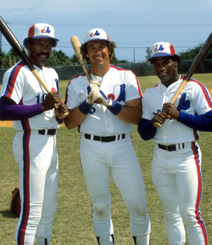
The Washington Nationals have honored the current franchise's history by sporting throwback Expos uniforms on occasion. That's good to see because the 1970s and 80s look of the Expos has grown iconic over the years. The red, white, and blue color scheme with the "eMb" logo - representing the French-Canadian Expos de Montréal Baseball -- is still a look worth celebrating in Canada and the U.S.
17 of 20
Quebec Nordiques
Rick Stewart/ALLSPORT/Getty Images
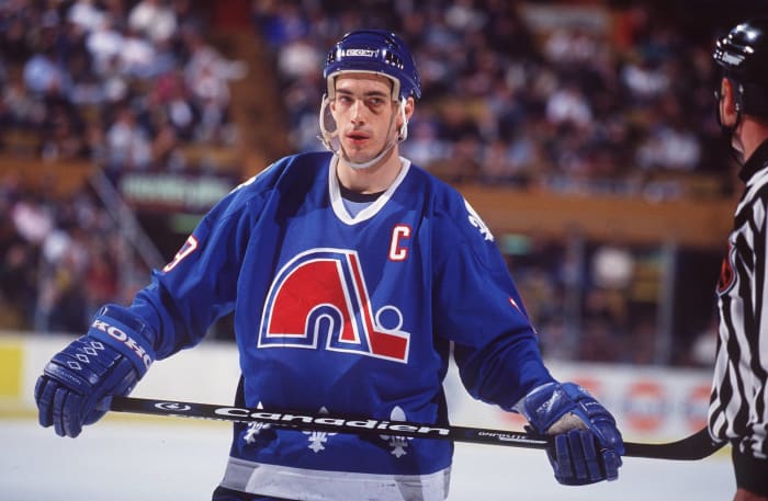
This was one of the great logos in all of sports. The red "n" with the stick and puck that made up an igloo. Adding the fleur-de-lis around the waist and on the shoulders only added to the overall elegance of one of the great hockey sweaters. In terms of defuncted sports jerseys, it does not get much better than this and is still a look that's celebrated by NHL fans of any allegiance.
18 of 20
Seattle Supersonics
Joe Nicholson/USA TODAY Sports
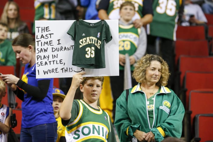
The Supersonics sported a few different logos and uniform styles during its NBA run from 1967-2008. Still, the best of the bunch remains the green, gold, and white with "SONICS" running across the chest. Also, the Seattle-skyline logo used from 1975-'95 stands out among the others. We don't want to give much attention to that late 1990s logo when a dark shade of red was incorporated and the "Super" was dropped.
19 of 20
Spirits of St. Louis
Bettmann/Contributor/Getty Images
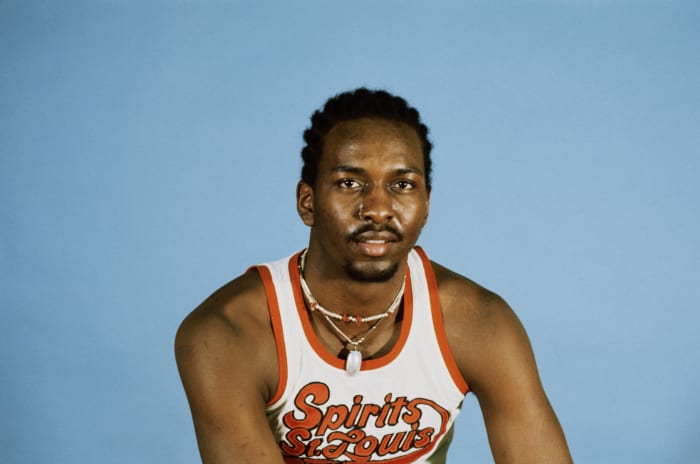
The Spirits were the third stop for an ABA franchise that began in Houston. Though the Spirits never got to join the NBA following the merger between the leagues, Hall of Famer Moses Malone and four-time All-Star Maurice Lucas played for the Spirits, a lively and fascinating group on and off the court. Of course, the famed uniforms with the classic plane across the chest under the name still live on in pro basketball lore.
20 of 20
Tulsa Roughnecks
sportslogos.net
One of the great logos in the history of the North American Soccer League belonged to the Tulsa Roughnecks. It was one of the league's premier franchises from 1978–1984. And that logo, with the roughneck oil driller, derrick, and soccer ball. was simply awesome. Not to mention, the collared uniform tops the players wore at times. The name lived on for a while as pro soccer remained in Tulsa, but the logo was eventually dropped.
A Chicago native, Jeff Mezydlo has professionally written about sports, entertainment and pop culture for nearly 30 years. If he could do it again, he'd attend Degrassi Junior High, Ampipe High and Grand Lakes University.


 +
+